
Overview
Good UI should feel natural—but it takes intention to get there. I design product experiences that are clean, functional, and built to scale—from onboarding flows to subscription screens and mobile dashboards. Whether I’m working within an existing system or creating new patterns, I focus on hierarchy, structure, and clarity at every step.
I’ve worked in health tech and fast-paced startup environments where aligning user needs with business goals wasn’t optional—it was essential. These four projects reflect that balance: thoughtful interface design, strong collaboration, and UX decisions grounded in real outcomes.
Key Stats
5× revenue growth supported by product UI + rebrand
$MM content launch led UX for Burnalong+
81% conversion lift from onboarding flow redesign
Partnered on UX updates for core growth features
UX Design for a Multimillion-Dollar Launch: Burnalong+
As the lead designer for Burnalong+, I crafted the UI and user flow for a new premium subscription upgrade—one that allowed Burnalong users to access thousands of local gyms and studios through the platform. This multimillion-dollar initiative spanned both product and marketing touchpoints, and aimed to drive discovery, engagement, and upgrades within the existing member base.
I designed key product screens including member onboarding, upgrade and downgrade flows, plan management, and multiple landing pages—all within Burnalong’s design system to ensure consistency and scalability. Alongside the product work, I led the creation of branded visuals and assets to support the launch across email, social, print, and internal channels.

Burnalong Product UI: Bridging Brand and Product
As the marketing designer at Burnalong, I stepped up to support the product team when we didn’t have a dedicated product designer. I helped shape and evolve the platform’s UI by designing within our system, collaborating across teams, and bridging the gap between product and marketing.
During the company-wide rebrand, I worked closely with an external agency—providing feedback, maintaining visual consistency, and aligning the product direction with our evolving brand. I also led the full UX and UI for Burnalong+, our multimillion-dollar premium content launch.
Many of the designs shown in this walkthrough are examples of screens I directly contributed to—either through interface design, exploration, or ensuring consistency across the brand and product experience. You'll see the Master UI Figma file, card design explorations, and a prototype of onboarding + class selection screens.
This work supported Burnalong’s 5× revenue growth and helped set the stage for its acquisition by Tivity Health.
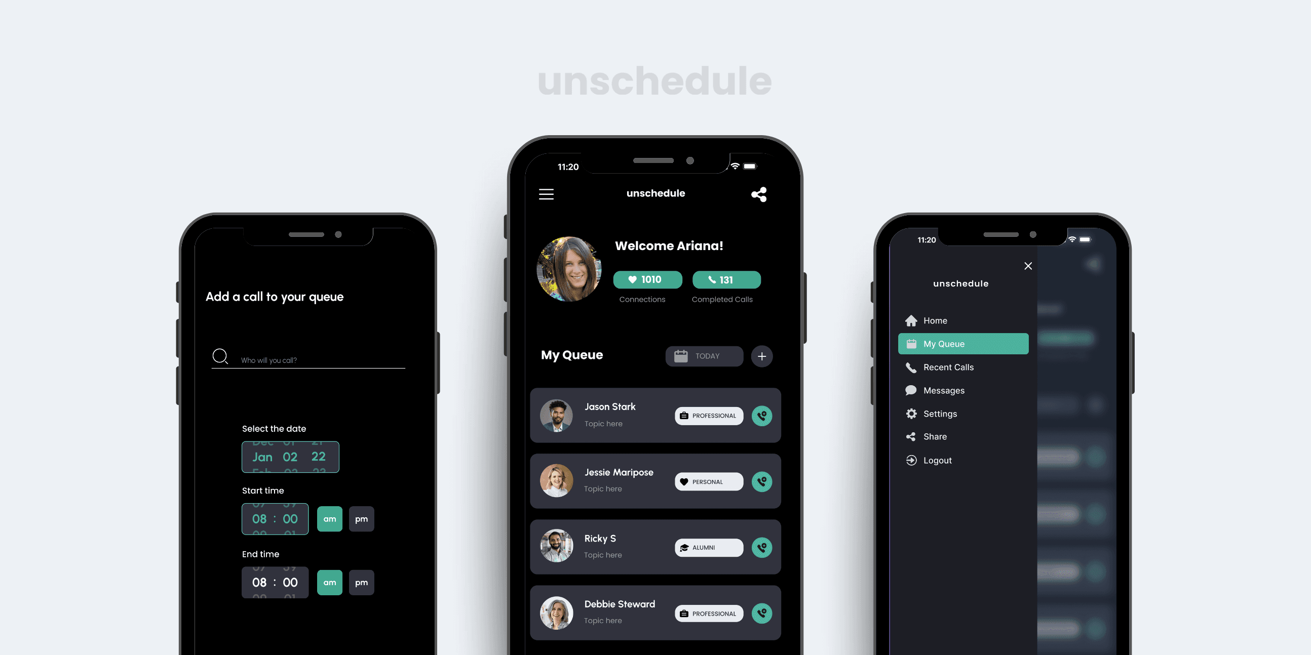
Unschedule: A New Way to Connect on the Go
Unschedule was a concept I explored while in conversations for a founding designer role at a pre-seed startup focused on building better one-on-one connection. The team had an early prototype on TestFlight, but no formal design system or polished flow—so I jumped in to rework and elevate the mobile UI, define the user experience, and shape the direction of the product through design.
The idea was simple: let people request a catch-up, then drop into their queue when time opened up—enabling more spontaneous, intentional conversations. It was built around availability, emotional context, and a different kind of scheduling behavior.
Although the company eventually paused hiring and didn’t move forward with development, I’m proud of how quickly I turned early ideas into a usable, structured design—and how this project reflects my ability to navigate ambiguity and bring emotional product concepts to life.
From sketch to screen, this work shows how I think through product flow, mobile UI, and moments that matter.

UX Research + Redesign: Earth Harmony Wellness
I redesigned the website for a local wellness center to create a more welcoming, intuitive experience, especially for new visitors looking to book a session or learn about the services. The original site felt cluttered and confusing, so I focused on simplifying the flow, organizing the content, and creating a more calming visual tone.
I started with a UX audit, identified key friction points, and developed a user persona based on real audience feedback. From there, I mapped the new site structure, created wireframes, and built responsive high-fidelity prototypes in Adobe XD. The final design feels lighter, more intuitive, and aligned with the heart of the brand.
This project reflects how I approach structure, clarity, and human-centered design—even on small teams with limited resources.
💡 I also compiled a full UX strategy report, which you can view below if you'd like a deeper dive into the research and rationale.
