Overview
Great design isn’t just about how something looks—it’s about how it works, feels, and connects with people.
From branding to web design, UI/UX to motion graphics, I’ve tackled projects that needed both big-picture strategy and hands-on execution—solving problems, improving usability, and creating experiences that feel as good as they look.
📌 This case study highlights four key projects that showcase my expertise across branding, UI/UX, web design, and motion.
Impact Highlights
Transformed brand identities
Designed & developed high-performing websites
Created compelling video content
Redesigned & optimized content layouts
Symmetry: Elevating Brand Presence
Symmetry Neuro-Pathway Training needed a brand identity that felt fresh, cohesive, and impactful. My goal? To refine and evolve their visual presence through clean lines, bold pops of color, and thoughtful layouts. I created a suite of templates for social media, video, email, and print materials, ensuring consistency across every brand touchpoint. Additionally, I redesigned key marketing assets, including a trifold brochure and flyers, giving them a polished, professional edge. The result? A stronger, more recognizable brand identity that resonated with their audience.
📌 Impact: Elevated brand perception and improved engagement through cohesive, professional design.
🔹 Visuals: Brand identity mockups, print & digital templates, social media assets.

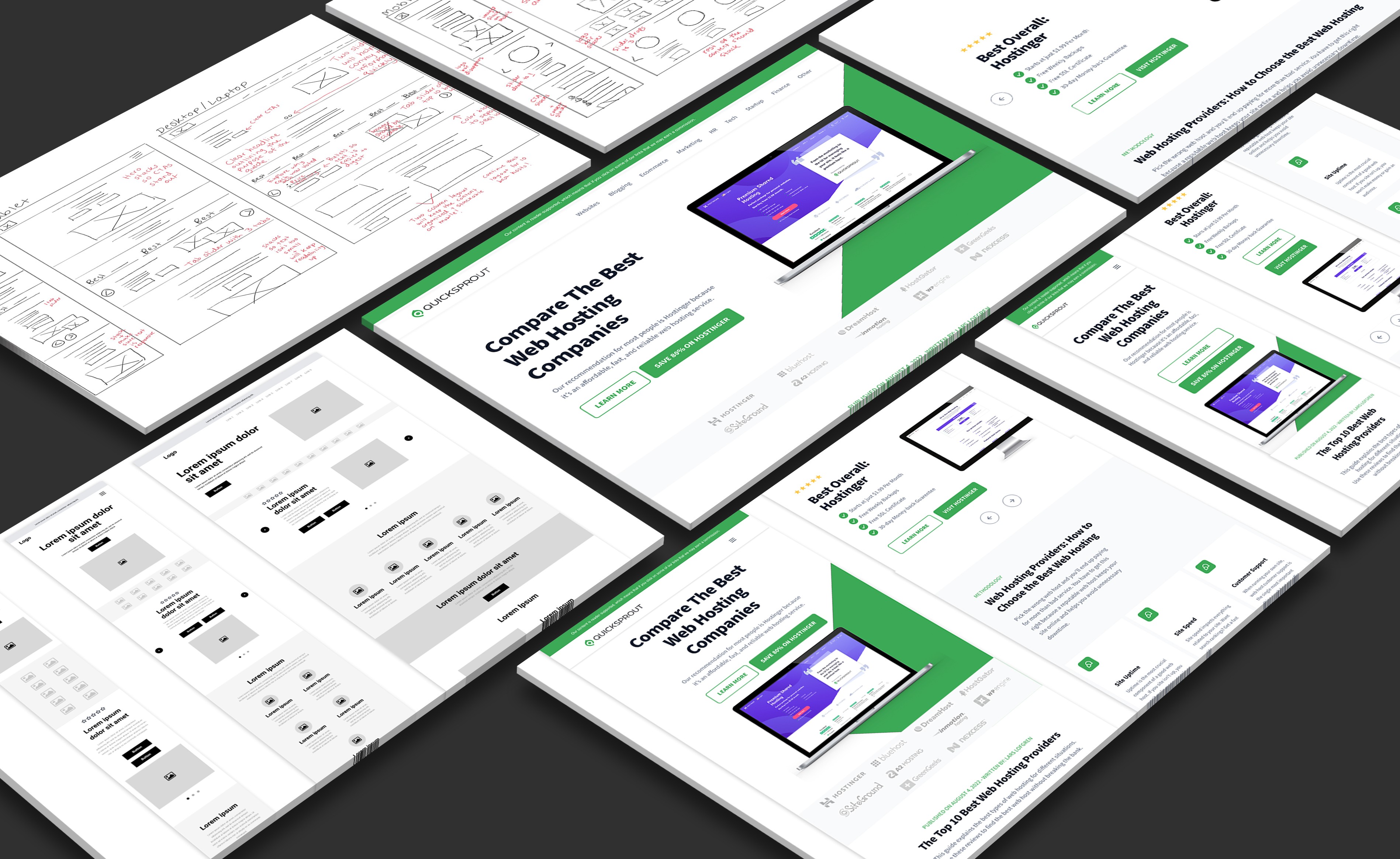
QuickSprout: Optimizing for Conversions
When it comes to landing pages, user experience is everything. I took on the challenge of redesigning a long-form content landing page for QuickSprout, with a laser focus on clarity, usability, and conversions. By implementing a modern, clean design with ample white space and clear visual separation, I made the content easier to digest. I also refined the user flow to make navigation intuitive and frictionless, ensuring that key messages stood out without overwhelming the reader. Through strategic CTA placement and UX best practices, I optimized the page for higher click-through rates and conversions.
📌 Impact: Improved readability, engagement, and conversion rates through a refined user experience.
🔹 Visuals: Before/after page mockups, wireframes, CTA optimization examples.
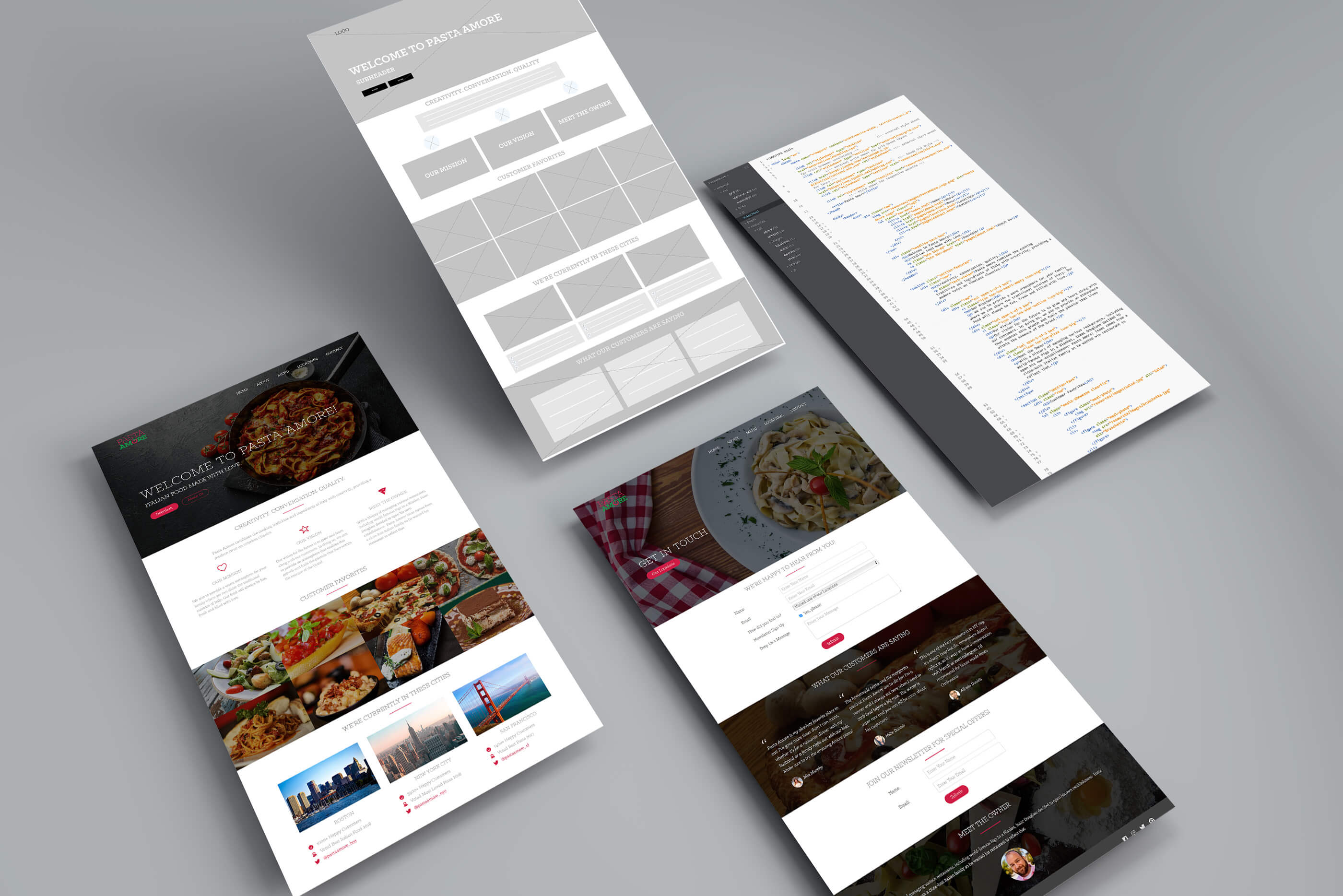
Pasta Amore: A Brand as Inviting as the Food
A restaurant’s brand should feel like an extension of the dining experience—visually rich, intuitive, and easy to engage with across every touchpoint. For Pasta Amore, I focused on user experience at every stage of the design process. I began with high-fidelity prototypes in Adobe XD that captured the warmth and authenticity of the brand, then brought the full site to life using clean, responsive HTML5, CSS3, and jQuery for smooth performance across all devices.
In addition to the website, I designed printed menus and table tents to reinforce brand identity in-restaurant, creating a cohesive experience from screen to table. From seamless online reservations to branded materials guests could physically interact with, every element was crafted to feel effortless and true to the brand.
📌 Impact: Increased online bookings and delivered a consistent, visually compelling user experience both digitally and in-store.
🔹 Visuals: Website mockups, menu design, branded table tents, UI breakdowns

TransFigure: Web & Video for a GLP-1 Brand
As Trainwell’s partner, TransFigure needed a polished, high-converting brand presence to match its growing influence in the health & wellness space. I collaborated closely with their General Manager to refine their branding, ensuring consistency across web, video, and marketing materials.
I designed a modern, structured website that clearly communicated their services, simplifying complex health concepts into an intuitive, digestible experience. To enhance engagement, I also created an explainer video to make their offerings more compelling. Beyond digital, I designed branded signage and marketing assets, reinforcing their credibility and making their brand feel established and cohesive.
📌 Impact: Strengthened brand perception and created a seamless, engaging experience across web, video, and print.
🔹 Visuals: Video designed in Premiere Pro. Cover designed in Canva.